Sick-Note
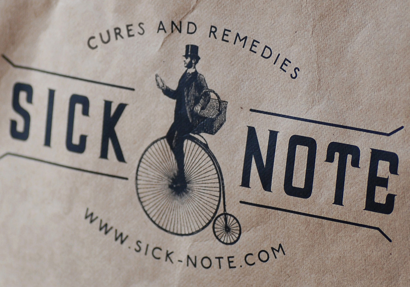
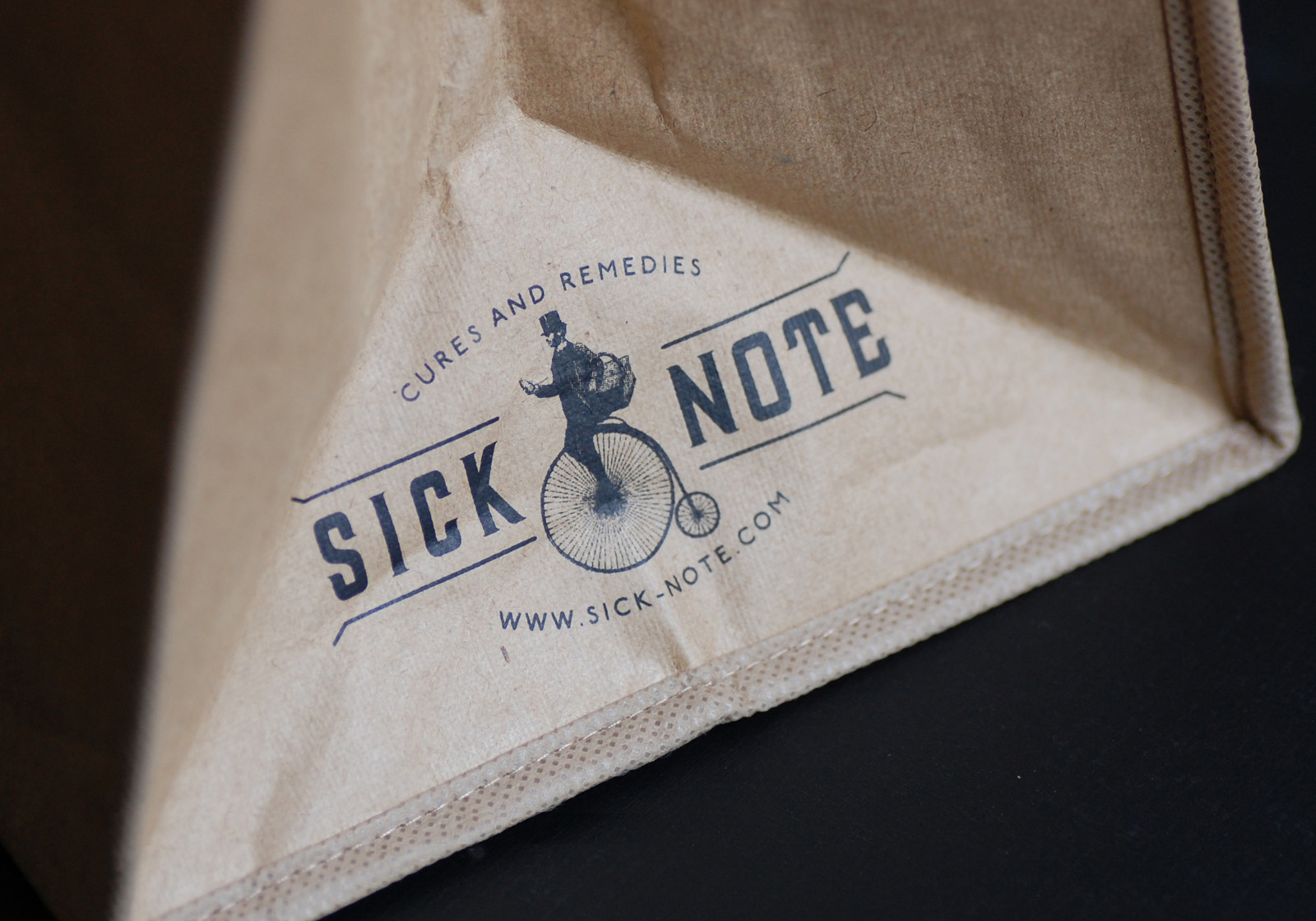
Sick-Note wanted an identity with a Victorian look and feel. Their brand is based around the idea of an old chemist shop, stocked with cures and remedies for even the most selfinflicted of ailments. Their quirky website will supply customers with films and chocolates, even when they have thrown a sickie! Acerte fulfilled their brief with a Victorian gentleman riding a penny farthing.
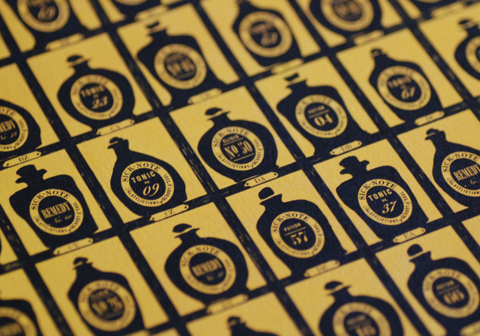
The concept was spot-on and has been used on all publicity for the online shop. Product packaging was produced using recycled materials and printed in one colour to give an authentic vintage feel. Goodies are packed and delivered wrapped in gorgeous multi-coloured tissue paper.
PROJECTS:
……………………
Branding
Packaging
Illustration